Table of Contents
Why This Decor Idea Matters
COHESIVE PALETTE is one of the most powerful elements in interior design, setting the tone for harmony, balance, and flow within a space. Color has the ability to transform mood, define style, and create a sense of intentionality that brings every detail together. Without a unifying palette, even the most stylish furniture and accessories may appear disconnected or overwhelming.
In today’s design trends, calm and curated spaces take center stage—whether achieved through minimalist whites, earthy neutrals, or bold jewel tones. By selecting a palette and committing to it, you not only enhance the visual appeal of your home but also shape its atmosphere: soft neutrals for serenity, vibrant contrasts for energy, or muted pastels for comfort.
What You’ll Need
Creating a cohesive palette doesn’t mean starting from scratch. Here’s what you’ll need:
- Base Colors – Neutral shades (white, beige, gray, taupe) or any calming foundation tone.
- Accent Colors – One to two complementary hues for furniture, textiles, or decor.
- Highlight Shade – A bolder color used sparingly to add personality.
- Sample Swatches – Paint chips, fabric samples, or online mood boards to visualize combinations.
- Lighting Consideration – Remember: natural vs. artificial light affects how colors appear.
Budget-friendly tip: Use free digital tools like Canva or Pinterest boards to test palettes before committing.
Decorating Steps
1. Define Your Mood
Ask yourself: Do you want your space to feel cozy, vibrant, or airy? Your answer will guide your palette choice.
Pro tip: Earthy tones work best for grounding, while soft blues and greens create relaxation.
2. Choose a Base
Select one primary color that dominates the room (walls, flooring, large furniture). Keep it neutral if you want flexibility.
3. Add Accent Shades
Pick 1–2 supporting colors for rugs, curtains, or pillows. They should complement the base without overpowering it.
4. Introduce a Pop
Choose one bold color—like mustard, teal, or terracotta—for artwork, throws, or statement furniture.
Pro tip: Limit this to 10–15% of the room for balance.
5. Repeat and Balance
Repeat shades throughout the room to create rhythm. For example, a navy pillow echoed in wall art or a vase.
Design Tips & Variations
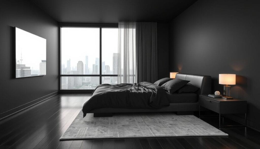
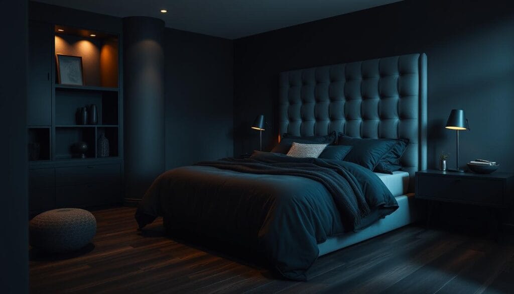
- Minimalist look: Stick with monochrome or subtle tonal variations (e.g., beige + ivory + sand).
- Modern chic: Pair neutrals with metallics (gold, chrome, or brass).
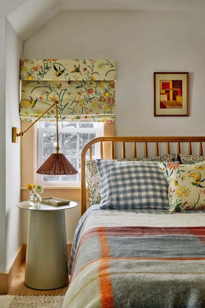
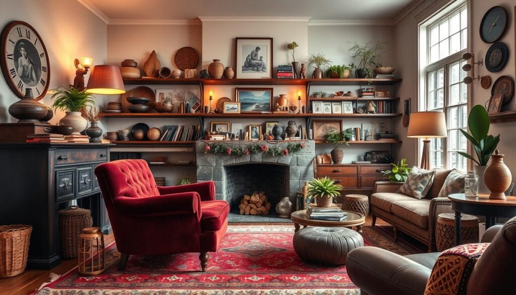
- Boho vibe: Mix earthy hues like rust, olive, and ochre with natural textures.
- Seasonal tweaks: Add warm reds/oranges in winter, switch to lighter greens or blues in summer.
- Textural play: Even if your palette is simple, use different textures (linen, velvet, wood) to avoid flatness.
FAQ / Common Challenges
Q: Can I mix different styles with one palette?
A: Yes—style mixing works as long as colors stay consistent across pieces.
Q: What if I love too many colors?
A: Limit your main palette to 3–4 colors. Use the extras sparingly as small accessories.
Q: Do I need to repaint walls for cohesion?
A: Not always. You can achieve harmony by swapping out textiles, rugs, and decor instead.
Q: How do I connect open-plan spaces?
A: Use the same base color throughout and vary accents slightly from one zone to another.
Conclusion & Call to Action
Having a cohesive palette isn’t about limiting your creativity—it’s about giving your home a visual rhythm that feels intentional and inviting. The right color harmony transforms your space into a retreat that reflects your personality and lifestyle.
Which colors would you choose for your own cohesive palette—calming neutrals, earthy warmth, or bold contrasts?


